
Landing pages capture information about your site visitors through a form or chatbot. While that’s the main purpose of a landing page, we at New Breed believe that if a landing page offers no further value to the site visitor, then forcing them away from their current location adds unnecessary friction.
Additionally, while all landing pages have the same goal, they don’t have to look the same. Common landing page formats include:
- Standard Classic: The standard landing page has a form above the fold and a clear value proposition. It’s easy to understand and fulfills the visitor’s expectations.
- Long-form: A long-form landing page offers more value upfront than the standard classic. There’s still a clear value proposition above the fold, but the page goes more in-depth into the offer and may provide a sneak peek. With this page style, the form is at the bottom of the page as you can see on our Inbound Marketing Assessment landing page.
- Video landing page: A video landing page is very similar to the standard classic, but instead of placing content next to the form, there’s a video explaining why you should download the offer.
- Conversational Landing Page: Instead of using forms, conversational landing pages use a chatbot to help users download the content offers.
But you don’t have to stick to those page styles. As more and more content is becoming ungated, businesses are getting more creative in how they position their forms and landing pages to collect visitor information.
Here are a few of our favorite landing page designs:
1. Ceros
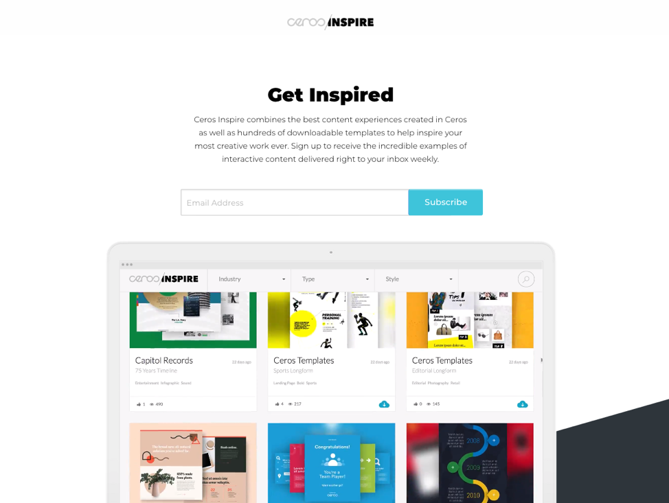 Ceros’s platform is designed to create interactive, experiential content. Their resources are examples instead of how-tos. Because they can create awesome content about anything, showing off what they can do is more beneficial to them than showing off how they do it.
Their CTA, “Get Inspired,” speaks to that. It’s nice, clean and simple. Underneath, there’s a short paragraph that clearly lays out what to expect if you subscribe to their newsletter.
Everything a page visitor needs to know to sign up for the newsletter is clearly laid out above the fold, and below the fold, they showcase additional examples and resources.
2. Drift
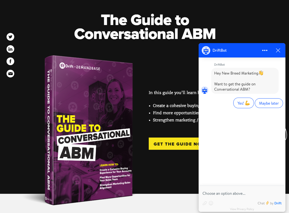
Instead of using a form, Drift uses a chatbot to guide page visitors through the process of downloading the guide.
We also like how below the fold, the landing page lists all the chapters to better illustrate what’s inside the guide.
Drift’s landing page is a great example of strategically gated content. This is where the online version of the guide is available ungated for anyone to look at, and then if someone wants to download the PDF, they’ll need to interact with the chatbot and provide an email address. This allows Drift to provide value before asking for anything in return.
3. Accelo
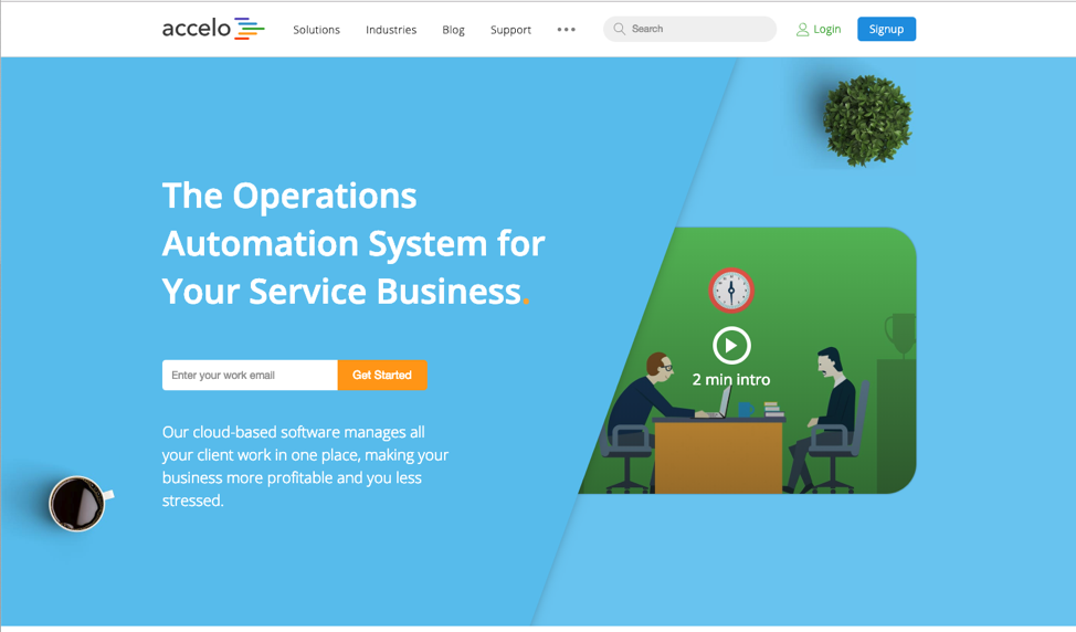
On Accelo’s homepage, everything is above the fold. You have immediate access to all the info you need to know, and there’s a simple sign-up action to take.
Plus, the video acts as an interactive value proposition that doesn’t fill up the page in the same way written content does. Unless copy is really dense, you typically can’t see written content all at the same time. This use of video allows a significant amount of information to be cleanly packaged above the fold in a visually appealing way.
4. Uber
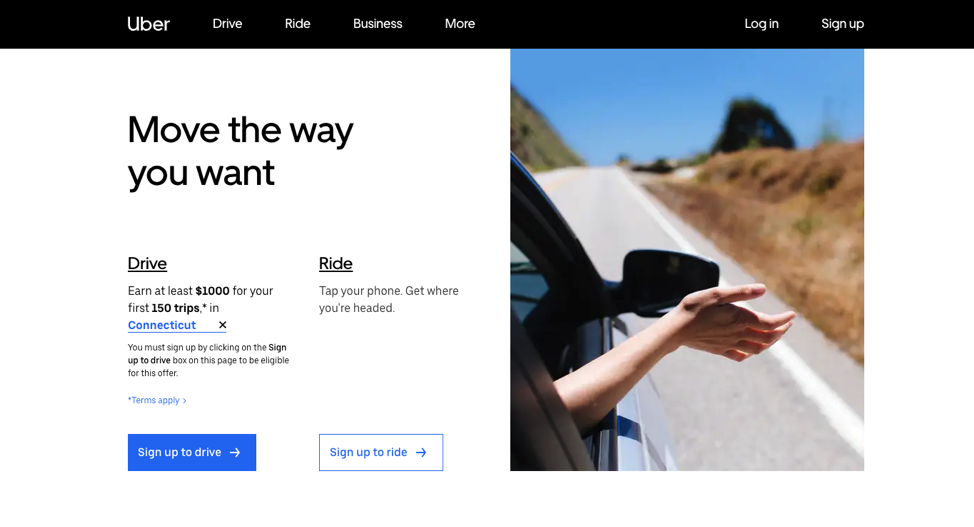
The more complex your solution is, the more you want to nurture people through the funnel. One way to make it easier for you to effectively nurture leads later on is to segment them initially the way that Uber does.
There are two ways people can use Uber: as a driver or as a rider. This form allows users to immediately segment themselves into the proper audience so they receive the information relevant to them.

5. Airbnb
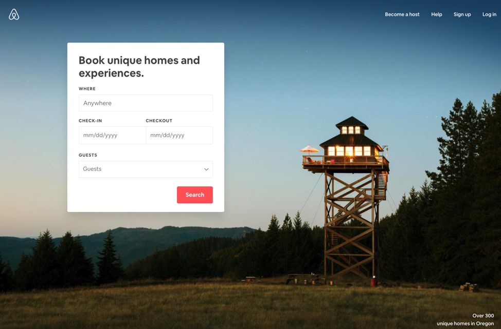
When people go to Airbnb’s homepage, they know exactly what they’re looking for: to book a vacation. Their website works pretty similarly to other hotel landing pages; they want to know where you want to go and your check-in and check-out dates.
They don’t add friction by requiring an initial sign up but instead start by providing you with their service offering. Once you find a place to stay and start booking, then you sign up.
We particularly like this page because Airbnb’s value proposition is all about creating unique experiences and the image they use illustrates a unique offering.
6. Tesla
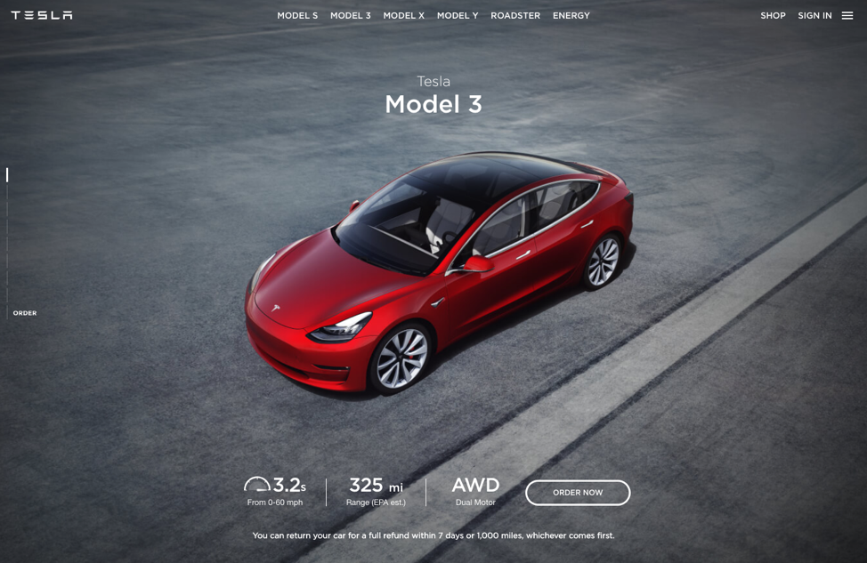
The main product Tesla is pushing right now is their Model 3. It’s their economy car and featured prominently in the main above the fold CTA on their homepage.
The product page for the Model 3 acts as a long-form landing page, providing information about all the car’s features and how they offer value for the consumer. Each section of the page features an “Order Now” button that makes it easy for page visitors to take the next step and start designing their car once they’ve obtained the information they’re looking for.
7. Slack
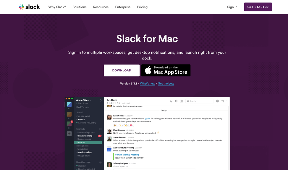
Slack’s landing page for downloading their platform segments users by the platform they’re viewing the website on and provides the appropriate download button.
The page contains a minimal amount of text, but still clearly illustrates the value proposition and shows an example of what the product looks like.
If you’re viewing the page from a computer, the page also provides an opportunity for you to receive the Slack mobile app link by text so you can easily access their mobile product as well.
8. Neil Patel
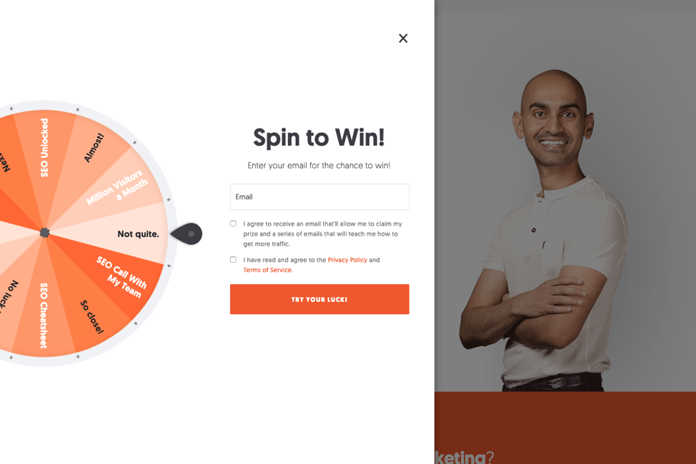
The spin to win wheel on Neil Patel’s blog is big and different. It provides the opportunity to win something, which feels exciting and intriguing.
This subscription form is different from other subscription CTAs, and in this case, we think different is effective. We were definitely tempted to enter our emails and try our luck.
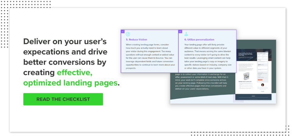
Create an awesome landing page for your site with our Landing Page Best Practices Checklist:
No comments:
Post a Comment