 Here at New Breed, our web team has been cranking out websites, blogs and other design/development projects for our clients. Since the start of 2018, they have launched 10 new websites and 13 new blog pages. We wanted to take a moment to bring their behind the scenes efforts into the foreground and celebrate four of our favorite recent blog page redesigns.
1. Rainmaker
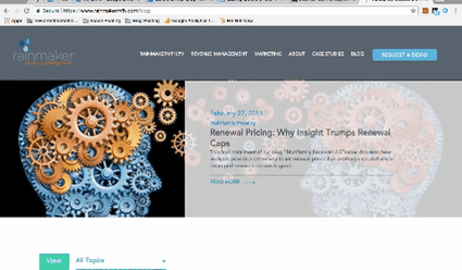
Why we love it: Its minor, yet beautiful, design details.
While seeking higher conversion rates is an important goal of any blog redesign, it can be easy to get so caught up in it that you forget about what it all looks like when all of the pieces come together. When our team redesigned Rainmaker's blog, they created a blog that is the perfect balance of functionality and aesthetics. The new blog now features small design details that pull the whole page together - in addition to improving the user experience. A simple, horizontal filter bar, engaging hover states over each blog post and a vastly improved mobile experience are a few examples. My personal favorite is the accent coloring for each of the blog tags and the CTAs!
2. SpringCM

Why we love it: It doesn't rely on a photo for every single blog post.
When SpringCM came to us to redesign their blog, we decided to throw out the rule book. It's a common SEO best practice to always have a photo (and appropriately keyword-filled alt-text) associated with each blog post to optimize it for search engine rankings. However, we at New Breed are beginning to realize just how difficult it can be to accomplish this without multiple, free photo resources. Unless you're taking your own photos to accompany each blog post, you just end up with a stock image library on your blog. To reduce the time and effort placed into sourcing overused stock photos, we recommended that SpringCM do away with the rule book and only include an image with their featured blog post.
See New Breed's full case study for SpringCM for more details
3. eTouches
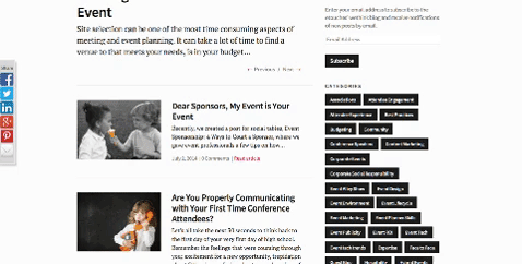
Why we love it: It ditched the sidebar.
Before our redesign, eTouches' blog was old school and badly needed to adopt the emerging trends in UI/UX. These trends are all about designing the easiest experience for your users - and their link-heavy sidebar and numerous tags weren't streamlining this experience. So, we ditched their sidebar and expanded their blog listing to the entire page. Now, when a user clicks to access the blog, they receive the content they wanted - without distractions. As a bonus, we added an endless scroll feature, so users can easily keep scrolling and consuming content!

4. Sadlier

Why we love it: It has dual filtering.
The Sadlier School came to us with multiple blog listings and the desire to condense all of them into a single one. We combined all of their content into their current English Language Arts blog, but this still left us with a ton of content to sort - and if it overwhelmed us, how would a user feel? Therefore, our team built out two discrete layers of filtering for them: you can now sort their blog content by grade range and then by a specific focus. This multi-level filtering could have created a messy user experience and negatively affected conversion rates. However, by keeping the filtering in a small, horizontal bar at the top of the page, it remains simple and easy to understand.
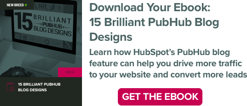
As more and more businesses build blogs, the standard methodology is becoming less effective. Download our guide "15 Brilliant PubHub Blog Designs" to see how the next generation blog can help grow your business.
No comments:
Post a Comment